
Zorg en Zekerheid App
At a glance
Duration
3 years.
Team
Scrum team existing of: Product owner, Scrum master, Business Analyst, Visual designer, UX/Interaction designer (me), Front End developers, Backend Developers and Testers.
My role
Product discovery, Problem definition (solving the right problem), Solution discovery, Solution validation, User testing, Information architecture, Interaction design, Mobile first design, co-creation, stakeholder management, Data driven design, DesignOps, UX strategy, Roadmap, KPI's.
Context
The company’s ambition is to improve their digital service and to get more digital touchpoints from their users, reducing costs. However, a disconnect between the web, native iOS and native Android environment was blocking this digital adoption. This project aimed at unifying the functionalities of the My-environment into one PWA (Progressive Web App) app. Myself, a Visual Designer and two Front end developers from Mirabeau/Cognizant joined the project to strengthen the internal team of Zorg en Zekerheid. To enhance their digital capabilities and provide guidance and advice from a human-centered perspective.
The challenge
The iOS and Android app were created by an external party and had low store reviews. Unifying them in a PWA put ownership of their environment back in the hands of Zorg en Zekerheid.
The challenge was to create a release approach where a combination of multiple environments had to exist alongside each other, while keeping the digital service consistent.
The approach
The collaboration within the team was based on Scrum/Agile. Working together with different disciplines, we implemented a user centric approach (Design Thinking) for each new feature we incorporated in the new environment.
This helped us make sure to not only migrate but also improve each feature we implemented.
The solution
We created a PWA app that met all technical requirements required for iOS and Android stores. It creates one improved, consistent experience across all digital touchpoints, including new functionality such as making and tracking declarations, invoicing, digital health insurance cards and more.
My contribution
Way of Working
When I joined the project, the first focus was on improving the UX maturity of the client by:
Implementing design thinking in the Scrum process. I integrated the design thinking process within the Scrum framework, ensuring that design activities are properly aligned with development sprints and iterative cycles.
Having a clear design process consisting of three main phases: research, concept development, and design.
Research: I conduct qualitative research to understand user needs, pain points, and preferences. This involves gathering user feedback, conducting interviews, and observing user behaviour to inform the design decisions.
Concept & Design: Based on the research insights, I create design concepts and prototypes that align with both user and business needs.
Impact
Implementing design thinking within the Scrum proces enhanced user-centricity, promoted iterative problem-solving, collaboration within the team, having flexibility based on feedback that is gathered, which ultimately lead to a better user experience.
Way of working, that makes transparent what tasks and responsibilities me and the visual designer had at Zorg en Zekerheid.
Derisking by Early User Testing
To minimise risks associated with design and development, I prioritise early user testing in the interaction design and visual design phases.
I conduct user testing sessions using priority guides to evaluate the usability and effectiveness of key features and interactions. This helps identify potential issues early on and ensures that the final product meets user expectations.
The same approach is used for testing the visual design, during this session more details in design, copy and interaction are being tested. Together with the learnings from the prior user test with the priority guides.
Impact
Lowering the risk of developing a feature that is hard to use and not wanted by users. User testing helps identify usability issues and design flaws, allowing us to address them before investing significant time and resources in development.
Saving time and eventually money. Early identification and resolution of design issues through user testing prevent costly rework and development iterations.
Increased user satisfaction. By involving users in the design process, we create a product that better meets their needs, resulting in improved user satisfaction and adoption.
Prototype of the priority guides.
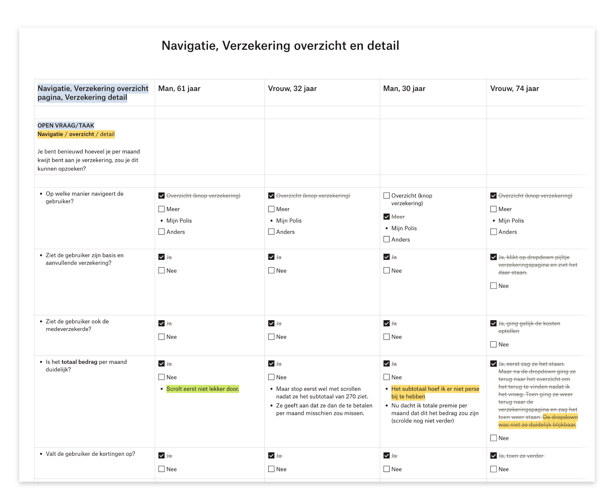
Users were given tasks to perform, during the tasks we asked them to think out loud. So we get a better idea of their needs and behaviour. It allowed us to ask better follow up questions. All the questions and doubts we had were documented up front and notes were taken during the user test to compare the results better afterwards. Looking for patterns in pain points and opportunities to make the design align better with the users needs.
Prototype of the visual design.
Data Driven Design
I dedicated time and effort into communicating the value and drive data-driven design to make better informed decisions. This was done by focusing on initiatives and showing the value rather than only talking about it.
By integrating Google Analytics into our work process, we gain valuable insights into user behaviour, their interactions with the product, and the effectiveness of our design solutions. I made sure this data informs our decision-making process.
To get a better understanding of the needs, motivations and pain points I took the initiative to ask pro-active feedback in the app. We did this by experimenting with Hotjar and Typeform surveys. It helped us to uncover why users are satisfied or unsatisfied with the app or a particular feature.
I was involved by the initiative to gain insights in our product via the Front Office. Gaining insights into their pain points and challenges related to the application. This feedback helped us shaping our design solutions for the future.
Impact
By embracing data-driven design, we achieved the following impacts:
Measuring the impact of our work: We relate our design efforts to key performance indicators (KPIs) and business goals, enabling us to measure the effectiveness and contribution of our design solutions.
Opportunities to improve the UX of the App: By analysing data and user insights, we identify areas for improvement in the app's user experience, leading to enhanced self-service capabilities, higher client satisfaction, call reduction, and increased digital client acquisition.
Cost reduction and retention focus: By improving the app's usability and meeting user needs, we contribute to reducing costs associated with support calls and enhance customer retention.
An overview of how the strategy and business goals are connected to our Team KPI’s, I connected measurements and actions to it. This helped the team getting insight into how we are contributing to the business objectives and what we need to do to be able to communicate our impact.
Designed features (+ impact)
Together with the Visual Designer, I was responsible for designing nearly all the essential features required in the App to replace the old environment.
Some features I would like to highlight include:
Declaration
Overview
Additional Insurance Usage
Paying Invoices
Declaration
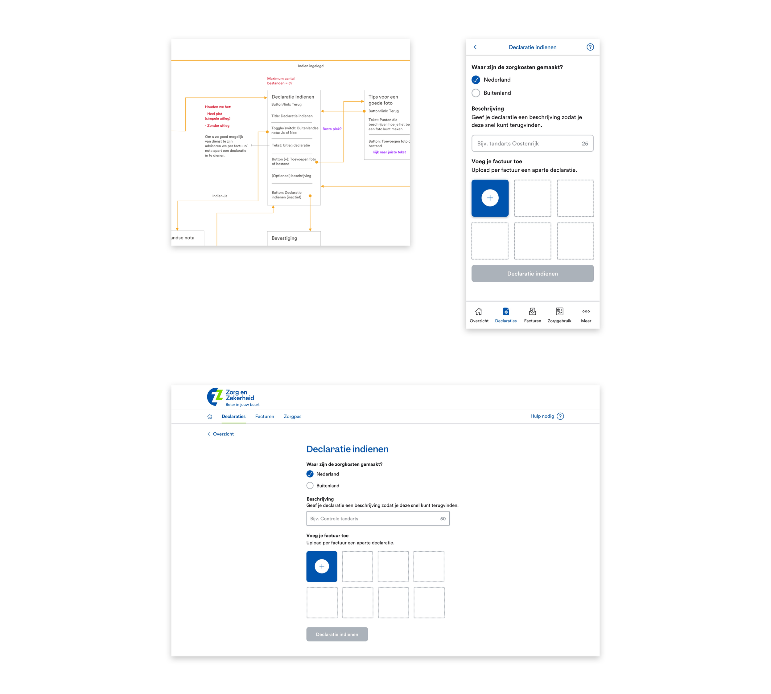
The primary goal of this feature is to enable users to make a declaration, replacing the old app where only declarations were allowed. Since it is the most frequently used feature by users, we prioritised its development. Other objectives of this feature include:
Simplifying the process by avoiding unnecessary information requests.
Allowing users to attach a picture or file to their declaration.
Providing feedback and confirmation throughout the process for a secure feeling.
Setting expectations for the subsequent steps after the declaration submission.
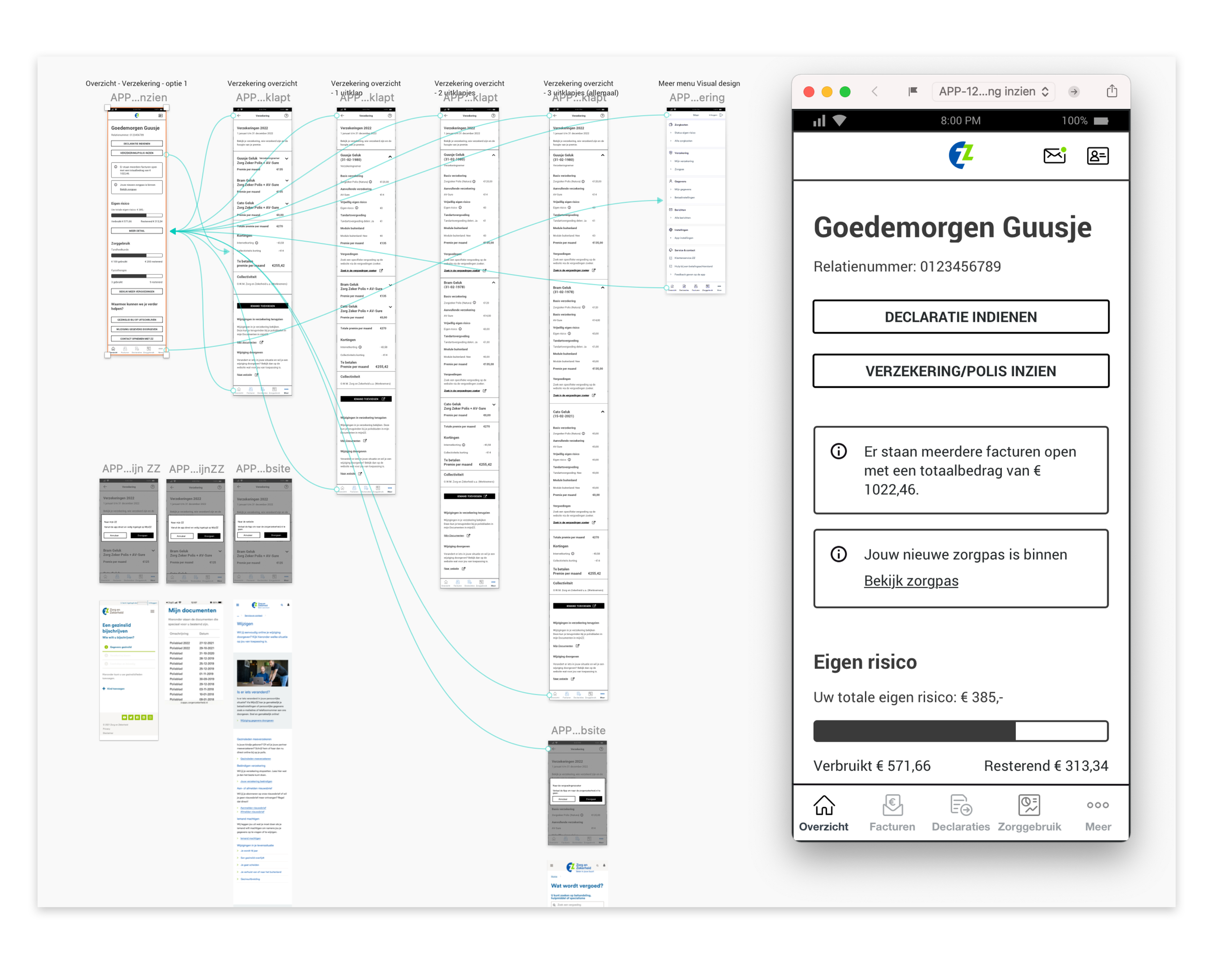
Overview
The goal of the Overview feature is to give users a concise and relevant summary of essential information, similar to a dashboard. It provides easy access to frequently used actions and insights without diving into the details immediately.
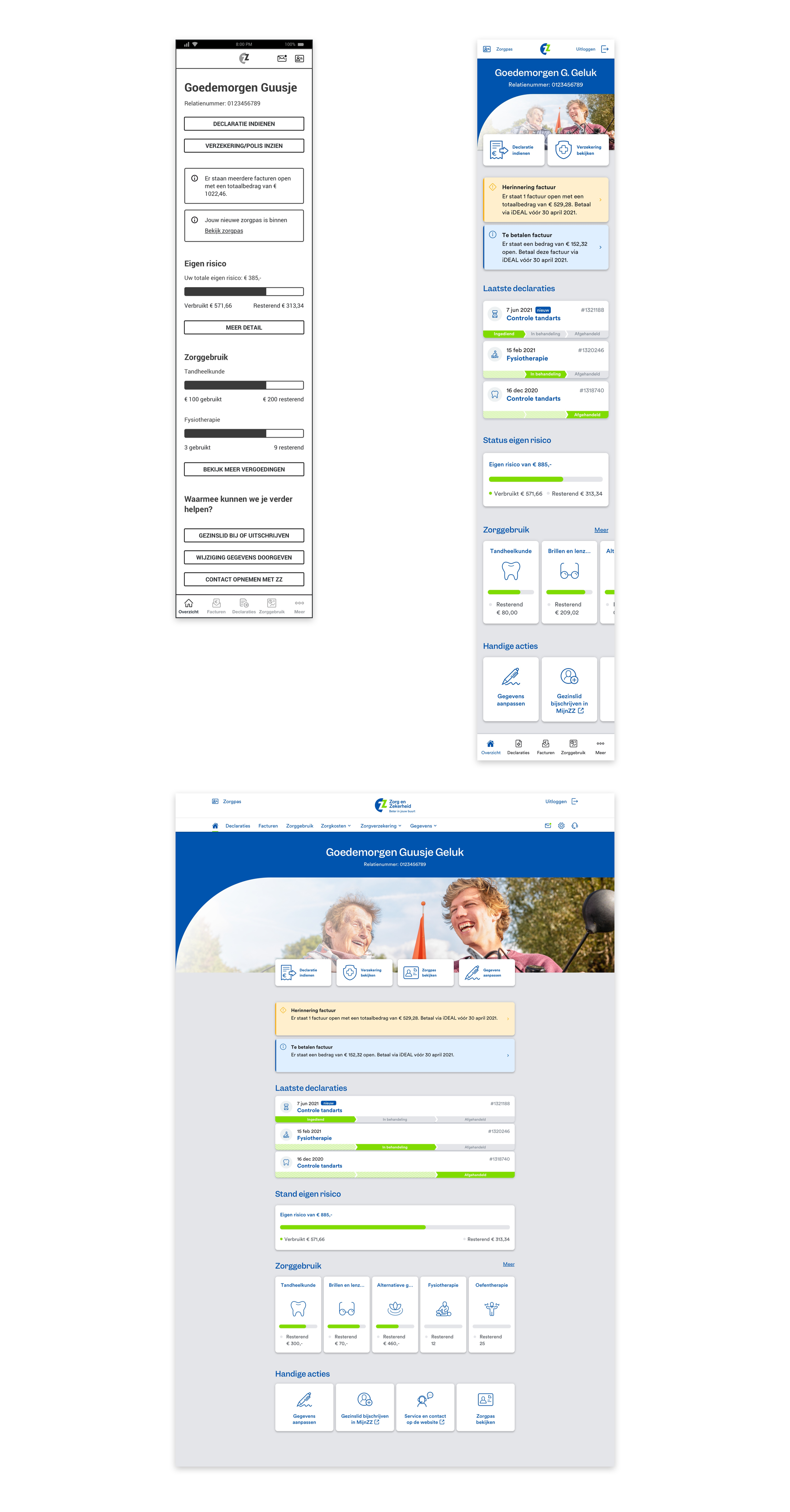
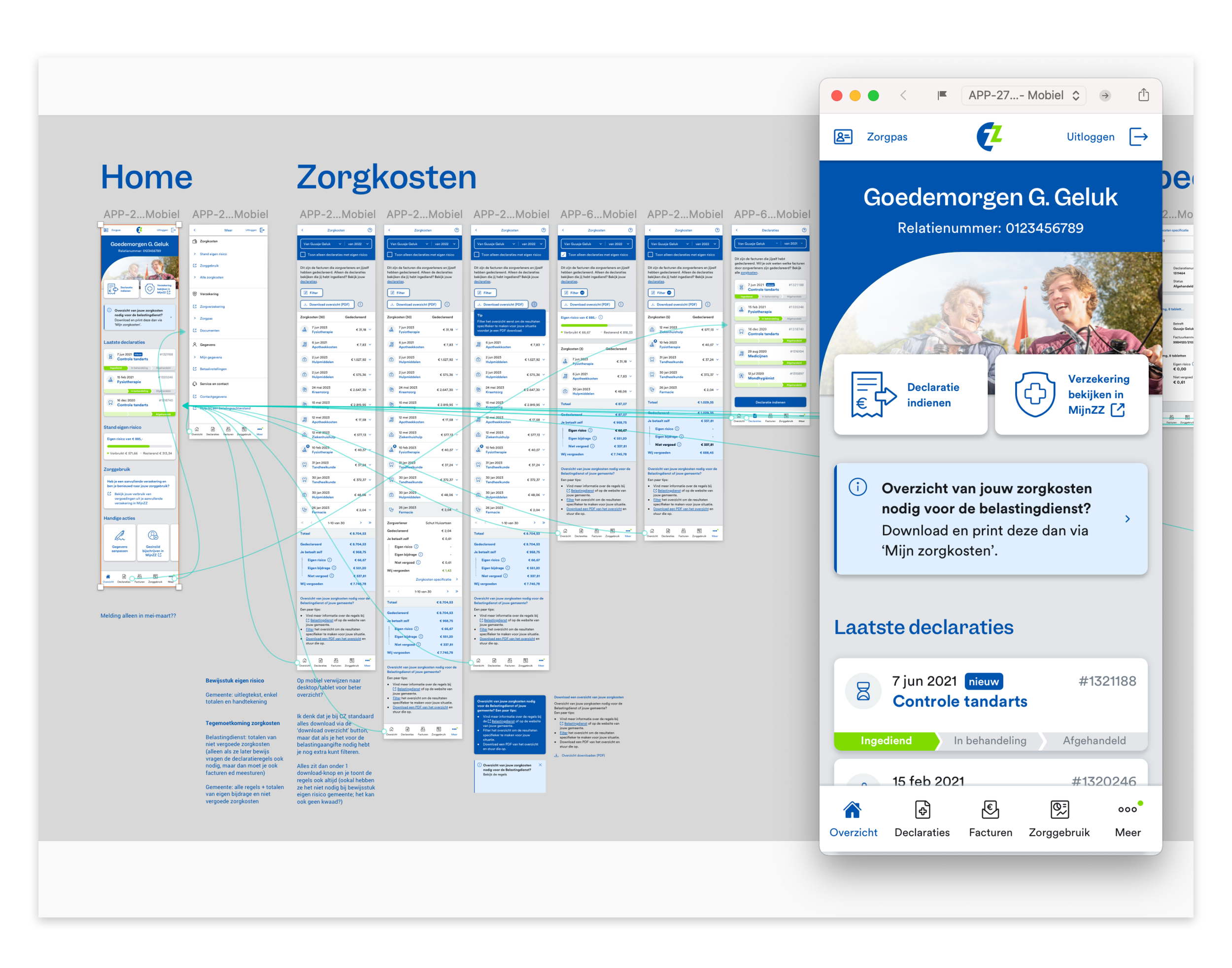
Additional Insurance Usage
The purpose of this feature is to offer transparency about the user's available health benefits from their additional insurance. It shows the top 5 most used types of health, with the most recently used type displayed on top. The top 5 list expands as other health types are utilized, ensuring users always have an up-to-date overview.

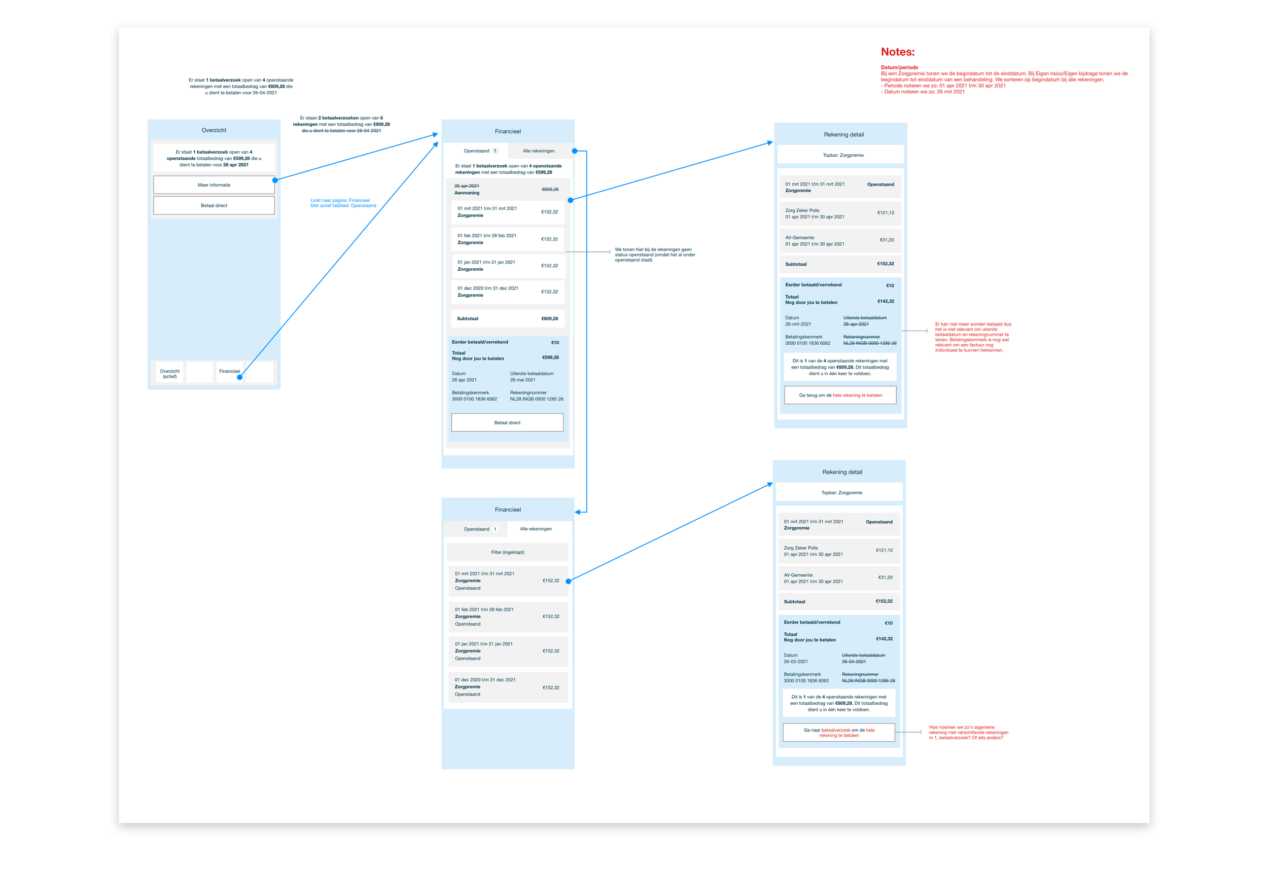
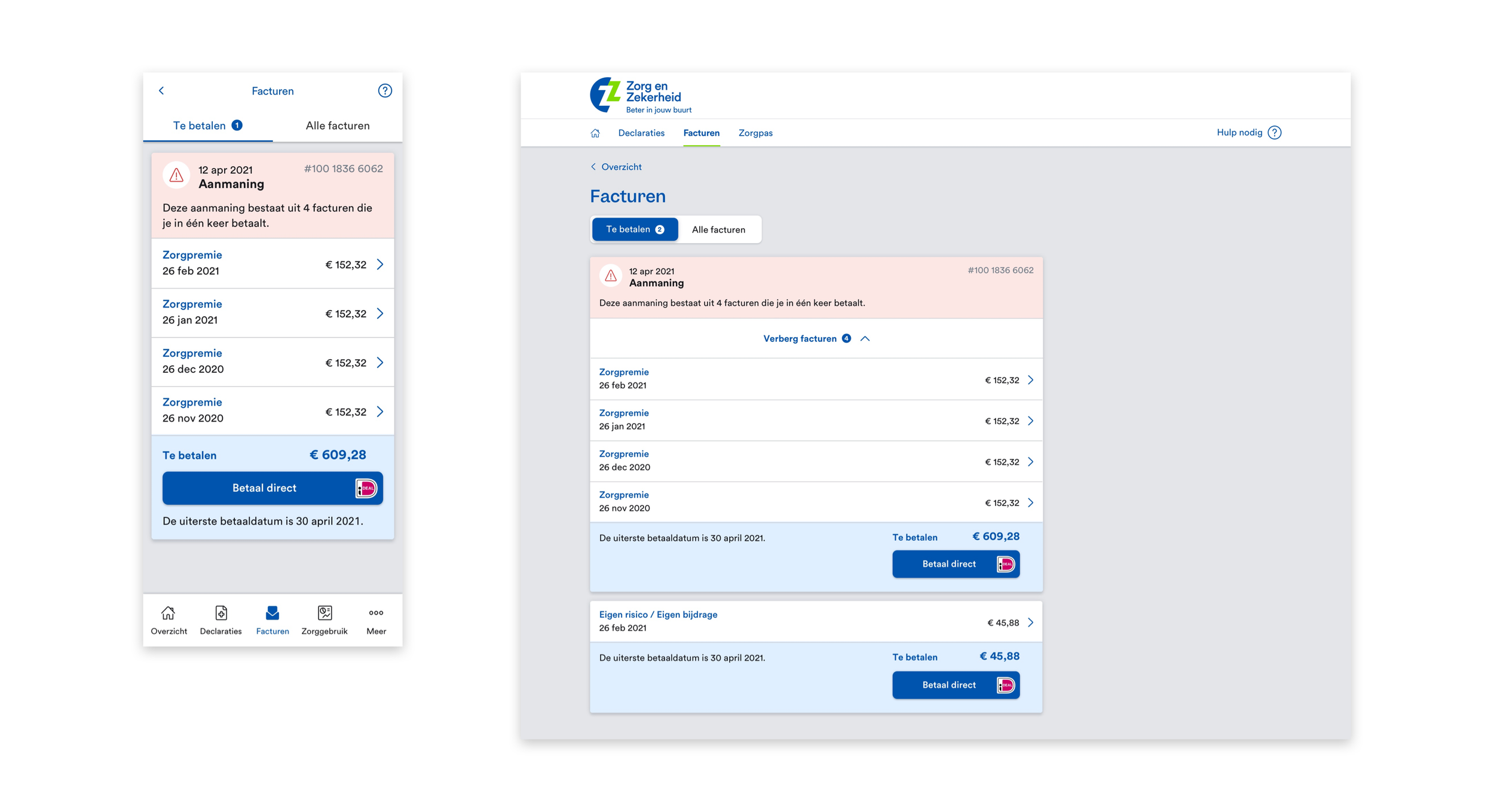
Paying Invoices
This functionality aims to provide users with an overview of paid and upcoming invoices based on their chosen payment arrangement. It also allows communication of invoices that need to be paid, with different levels of urgency. The feature provides a clear overview of each invoice and allows users to easily check details when needed, ensuring a straightforward and understandable experience, promoting timely payments.
Connect App and My Environment
To bridge the functionality gap between the new app and the legacy environments, I helped in connecting both systems. This connection allowed us to incorporate missing functionality from the legacy environment into the app, resulting in a seamlessly integrated user experience. Users can now access all relevant information from the legacy environment through the app.
Impact:
Bridging the functionality gap ensures a smooth transition for users, maintaining the continuity of their workflows during the transition period.
The connection between the app and the user's environment enables the creation of additional user journeys, expanding the application's capabilities and value.
Integrating relevant information from the legacy environment establishes the app as a single, comprehensive source of information.
Overview of all links we are offering in the app towards the legacy my environment and the website. This way we could offer more journeys that are relevant to the user. It helped in expanding the self service of the app, which leaded to more satisfaction among users and call reduction.

A couple of examples more zoomed in of how we offer functionality/journeys from the app and link them towards the legacy my environment and website. To help the user understand the current location we added a top bar which contains the url and a back button that leads back to the app.
Design System + Storybook
To streamline our design processes, we consistently focused on documenting components in our Design System, ensuring clear descriptions, variants, and implementation guidelines. We also integrated Storybook, allowing us to visualise and experience the interaction behaviour of the components.
Impact:
Always Up-to-Date: The connection between the Design System and Storybook ensures designers and developers have access to the latest version of UI components, promoting consistency and efficiency in the design and development process.
Easy Comparison: With the implementation of Storybook in the design system, designers and developers can easily compare the expected design with the developed component, facilitating quality assurance and reducing inconsistencies.
Smooth Onboarding: Having a Design System with Storybook simplifies the onboarding process for new team members, providing a comprehensive resource to understand and utilise design patterns and UI components effectively.

Impact
Through my contributions as an UX/Interaction Designer, the UX and maturity of the client significantly improved. Leading to positive impact on the business goals we were contributing to.
1. Improve client satisfaction
Through the implementation of design thinking, me and the team significantly improved the App's user experience and future my environment. App ratings on both the Apple App Store and Google Play Store increased from a near 2 star rating to around a 3.7 stars. The gradual improvement in ratings reflects the positive reception of our efforts.
Note: The average of the Apple App store is currently low, due to all the old ratings that still influence the average. For a more representative average I took all the ratings from the past year, which comes down to a 3.8 star rating.
2. Call reduction
Through early user testing in the interaction and visual design phases, we identified and addressed usability issues, resulting in a more user-friendly app. The improved user experience reduced the need for support calls, contributing to call reduction. Working together with different departments like the Front Office and Administration during feature development ensured that we were able to proactively address common issues and questions that users often called about.
3. Improve Digital Service
By embracing data-driven design, we used insights from user feedback and behaviour to improve the app's usability and self-service capabilities. This led to an enhanced digital service experience for users.
4. Increase Digital Customers
The design processes ensured a more consistent and efficient design and development process. This led to a better user experience, attracting more digital customers to the app.