JMango360 App Redesign
At a glance
Duration
4 months.
Team
Huey Le, Maarten Schuiling, Frank Geurts and Jesper Duinker.
My role
Design thinking process, Research, User research, Interaction Design and UI Design.
The challenge
During my time at JMango360 I proposed to redesign the current mobile app of JMango360. The native app is part of the JMango360 Software as a Service model, enabling e-commerce companies to grow successfully on mobile. It runs on both IOS and Android devices.
The challenge: How can the partly outdated design of the mobile app of JMango360 be redesigned so it is up to date to current user experience and user interface standards of shopping apps?
The solution
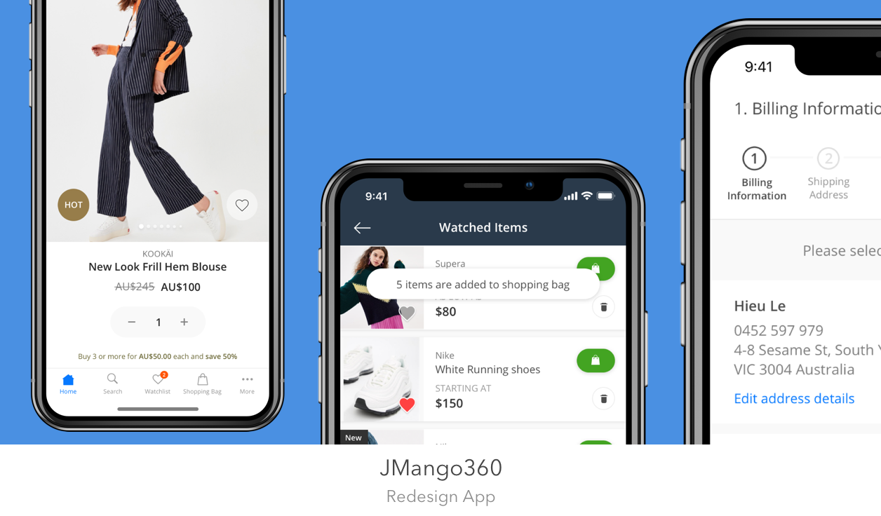
A complete redesign of the native mobile commerce app running on both IOS and Android. It was important that all the current features of the mobile app were implemented, as well as including new feature requirements. The redesign takes care of a smoother and more enjoyable shopping experience.
Design process
Research methods & Results
1. Interview with Sales and Support
Before focusing on the interviews and tests with real users, an interview was held with the people who often talk with the customers. The goal was to get to know the customers via my colleagues and to get more knowledge about their user needs and desires. They are often receiving feedback from their app users. By hearing that feedback I could already try to analyze the biggest issues with the current design.
From working with the product for more then 1,5 years and having contact with customers, I could compare my findings with my colleagues. Some of the key findings were:
Products need to be presented bigger.
The whole design needs to be updated to today's standards.
The navigation should be more structured.
The checkout needs to feel more secure and clear, where are you at the moment and which steps are left.
2. Qualitative interviewing & User testing
The interview and user test was all about understanding the user and to identify their main challenges. Having an overview of these challenges, as well as knowing the users goals will give me a better understanding of what the user wants. Since we were tight on time and money, we only interviewed and tested with 5 users. According to Nielsen (Nielsen, 2016) this is an ideal amount, you will already find more then 75% of the usability problems. After that amount you will learn less and less, because you come around the same problems again and again.
The interview was combined with tasks for the user. Underneath I will give you a brief description of the topics and questions.
Step 1: Understand the user (get the bigger picture)
These questions were focused on gathering ethnographic data, like age and gender. The knowledge and use of technology (apps) in general was also gathered.
Step 2: Understand how they do it (Topic specific questions)
This part was about understanding how the users use the app and get a better understanding of the workflow. Specific tasks were given to the user to identify how they use the app. The tasks were focused on the previously identified problem areas in the app relating to: search, product presentation, filtering products, sorting products and the checkout.
By doing this we could identify use cases and clarify which tasks are important for them and improve the workflow of the user. The 5 Why’s methodology was used in order to understand to get down to the cause of their problem (the root cause).
Step 3: The users main objectives and motivations (product opportunity questions)
After having a better idea of the user’s workflow, I could dig deeper in the problem areas. Asking the user’s what could be better and how and what might keep users away from using this app.
Step 4: Product reaction questions
These questions were focused on gathering the final problems the user might have experienced. Focusing on if there was anything surprising or unexpected during testing and if they were missing something.
Results
The results of the interviews were gathered in a persona.
3. Persona
4. Competitor analysis
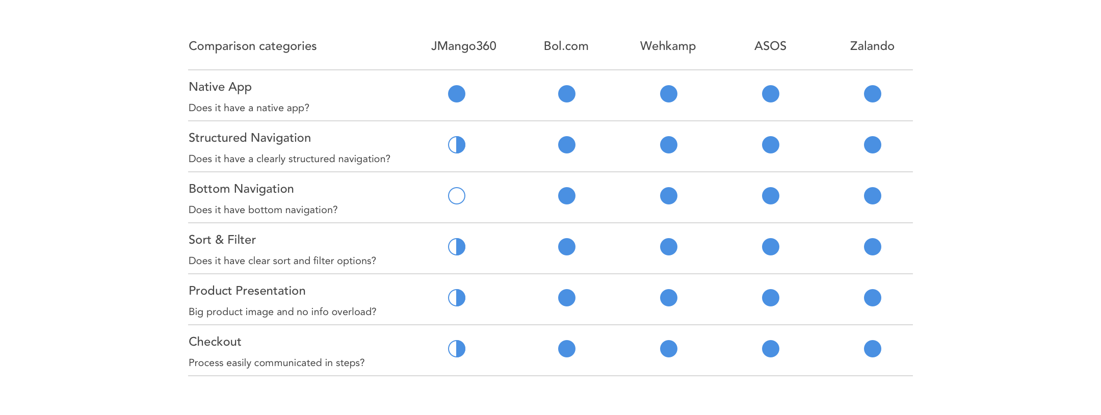
For the competitive analysis, we decided to focus on the best competitors in the market. I have to say that we can not compete with big companies as: Bol.com, Zalando, Asos and others, their budget is way bigger on all levels and they focus on developing one specific app. Us on the other site provide a Software as a Service solution, which means we have to develop something that is suitable for many different clients. Nevertheless we compared with them because many of the customers compare our app to these competitors. Our goal is to compete as much as possible on User Experience level with these competitors. The competitor analysis was focused on the results of the interviews and the persona.
Insights
All the competitors have a fully native app.
Their navigation is structured and there can be easily navigated between categories.
All the apps have bottom navigation.
Sorting and filtering is placed at the top and easily accessible.
The presentation of a product is clear and the product images are as big as possible. Especially in fashion.
The checkout is structured and divided in clear steps.
5. Journey Map
With all the information that was gathered from the interviews with colleagues and users. A journey map was created to develop more empathy with the user and keep the users needs and pain points in mind for the new design of the app.
In the journey map you will see the actions and the related problems. Underneath the problems are explained in more detail with a solution.
6. Final Design
Before making the ‘final design’, many ideation and design iterations took place before we ended up with this design. To give an idea of what the end result looks like the old design of the biggest problems are shown beneath, with the new design that solves the problems. The solutions are mainly based on the proposed solutions discussed in the journey map.
7. Heuristic evaluation
Heuristic evaluation was used to fast and effectively evaluate the new design of the app. We used the heuristics by Nielsen J. (1995). These can perfectly be used by evaluating mobile applications as well.
Visibility of system status
Match between system and the real world
User control and freedom
Consistency and standards
Error prevention
Recognition rather than recall
Flexibility and efficiency of use
Aesthetic and minimalist design
Help users recognize, diagnose, and recover from errors
The comments were placed in InVision, so everyone involved could take a look at the design and comments. Based on those comments new improvements were made to the design.
Next steps
The design is now being implemented. First they will implement this in the form of a Progressive Web App. After they will start with building the native IOS and Android app with this design.
Reflection
Tools & Methods
Interviews
User story (personas)
User journey
Ideation (brainstorming)
Prototyping (sketching, low and high fidelity)
Sketch App
InVision
Impact
Delivered a design for a shopping app that will be used to sell all kinds of products by a wide range of customers.
The design will be used for making a Progressive Web App and a Native app for both IOS and Android.
Used extensive user research, ideation, and an iterative design process to create high-impact design opportunities.
What I have learned
This project I learned more about user experience in shopping apps, what works and what does not work for a user.
I also improved my Sketch skills by taking care of the User Interface with my colleague Huey.
By using a Journey Map you can easily visualize the problem areas of ‘journey/process’ a user goes through. It helped me with implementing the results after interviewing the users and empathize more with their feelings during the journey.
Something that was hard was communicating with the other UX designer Huey, he is living in Melbourne and was not able to participate well in the research and ideation phase.
Resources
Nielsen, J. (2016). Nielsen norman group. Internet: https://www. nngroup. co
Nielsen, J. (1995). 10 usability heuristics for user interface design. Nielsen Norman Group, 1(1).


